Bahati 

Discipline

Brand strategy / Full brand identity / Packaging direction / Campaign art direction

Year

2026

Status

Brand identity direction

Bahati hero artwork
Overview

Bahati is positioned as a considered scalp-care brand where healthy hair begins with a more intentional relationship with the scalp, ingredients and daily ritual.

A botanical scalp-care identity that combines restorative ritual, natural ingredients and quiet premium confidence.

01 / The challenge

Finding the clearest idea inside the complexity.

The category is crowded with clinical claims on one side and generic natural beauty codes on the other. Bahati needed to feel grounded in nature while retaining the precision, trust and desirability of a modern premium care system.

02 / The response

A system designed to stay expressive as it grows.

We explored a family of organic marks before developing a refined botanical direction supported by elegant typography, deep forest greens, mineral neutrals and warm metallic detail. Packaging studies, product still life and campaign compositions establish a tactile world of leaves, stone, fabric and restorative calm.
Selected frames

Identity, detail + experience.

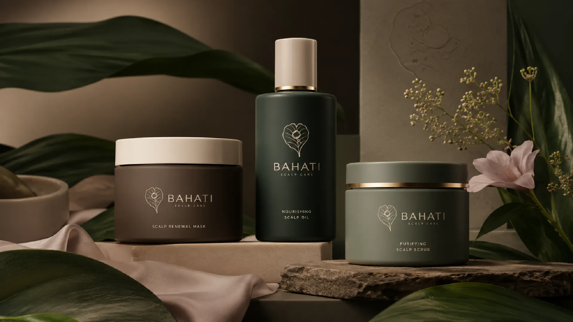
Bahati scalp-care product family in a botanical setting
A complete care range presented as one calm, premium product family.
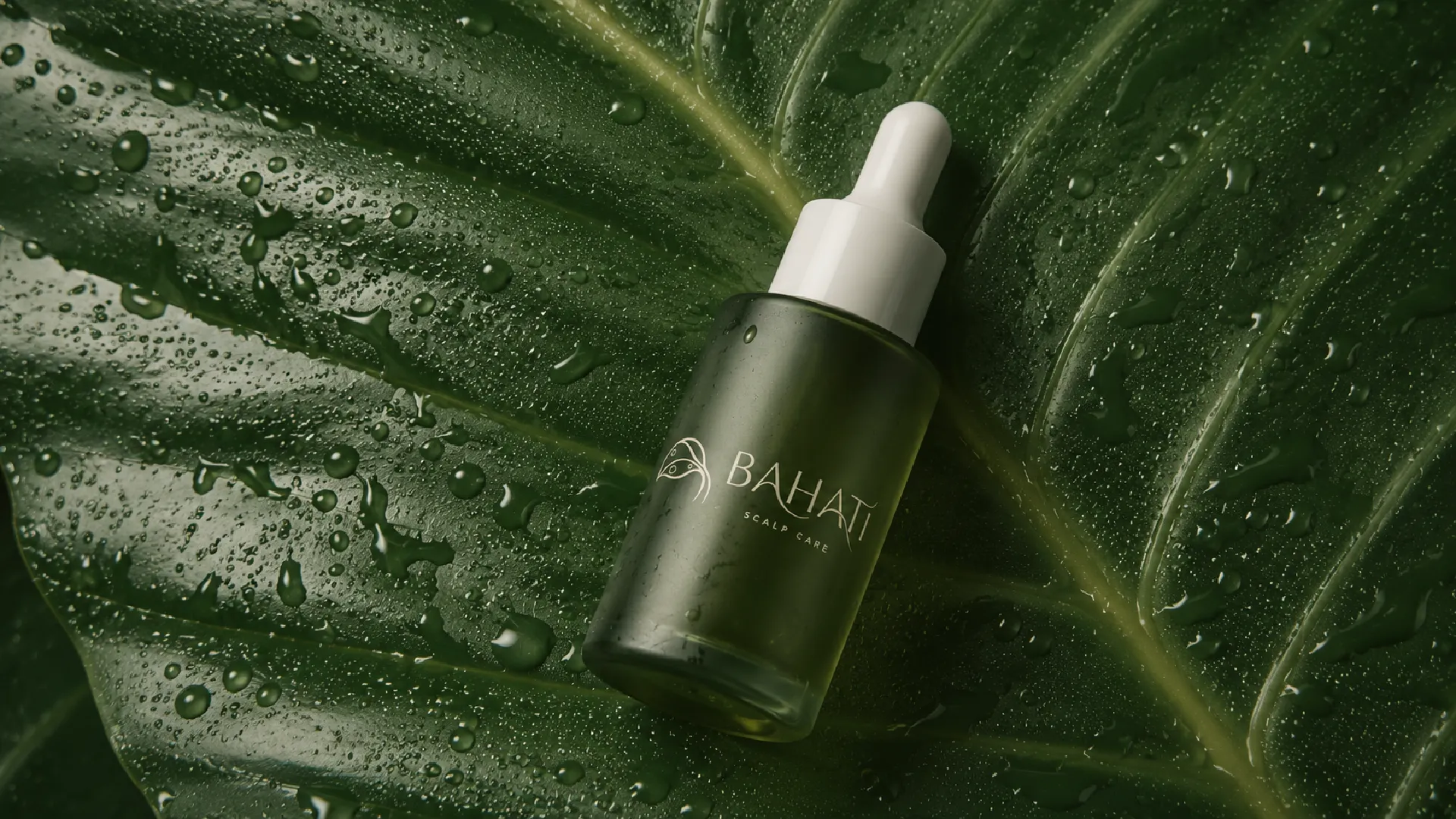
Bahati scalp oil dropper on a wet leaf
Natural ingredients and restorative moisture shape the product world.
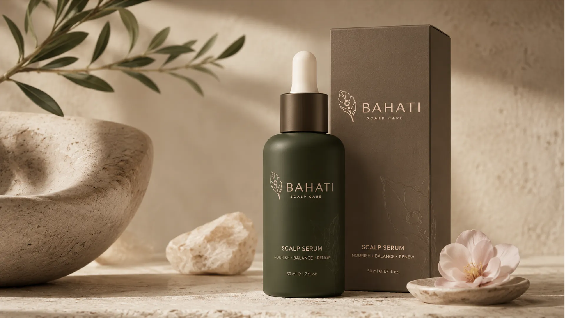
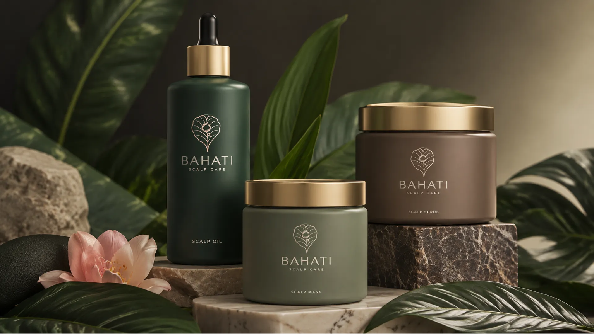
Bahati bottle and packaging still life
Packaging balances botanical warmth with clear, contemporary hierarchy.
Bahati scalp-care jars and nourishing scalp oil
Forest green, taupe and soft mineral tones create a grounded premium palette.
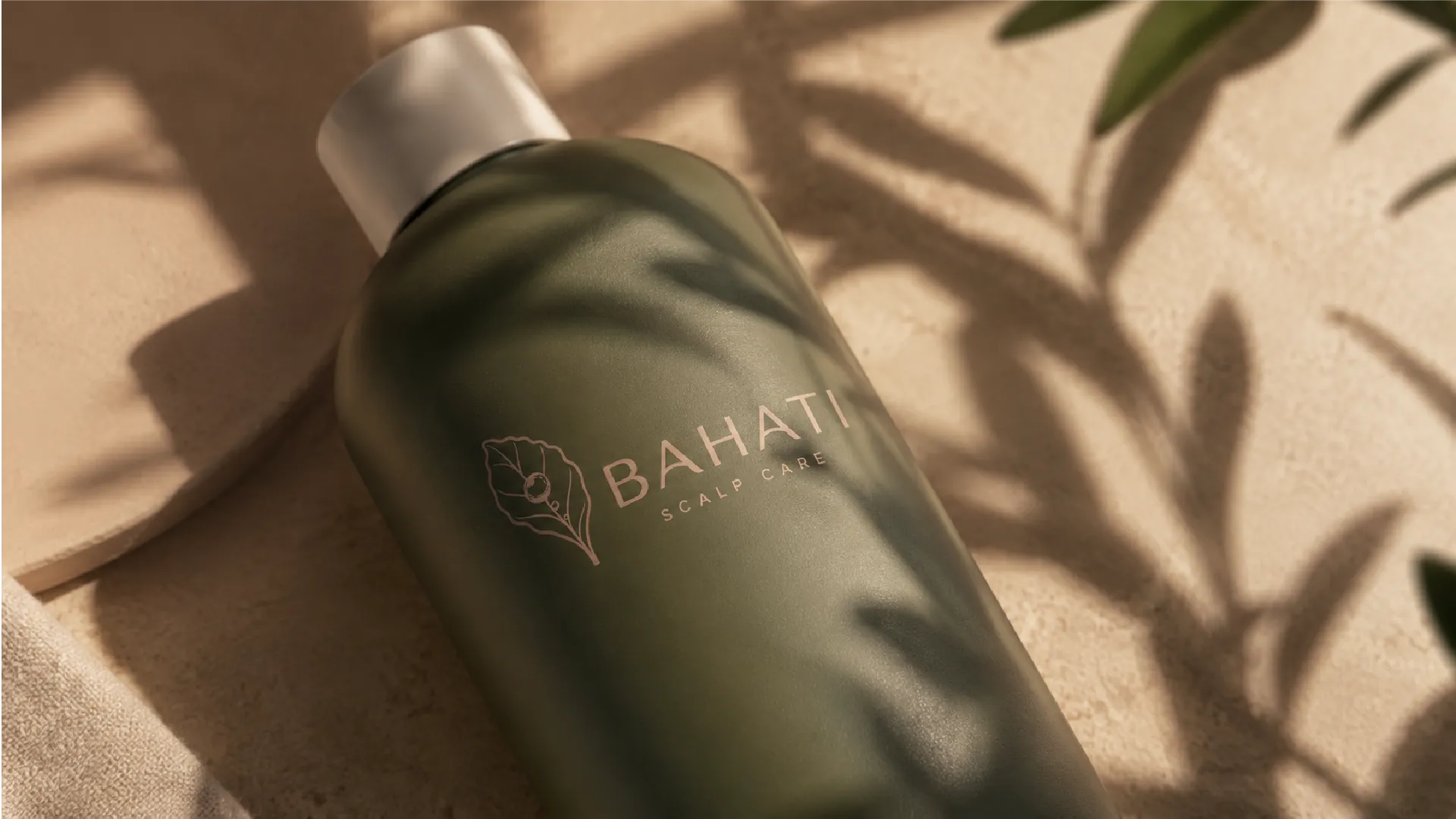
Close crop of Bahati green product bottle
Metallic detailing adds restraint and polish at close range.
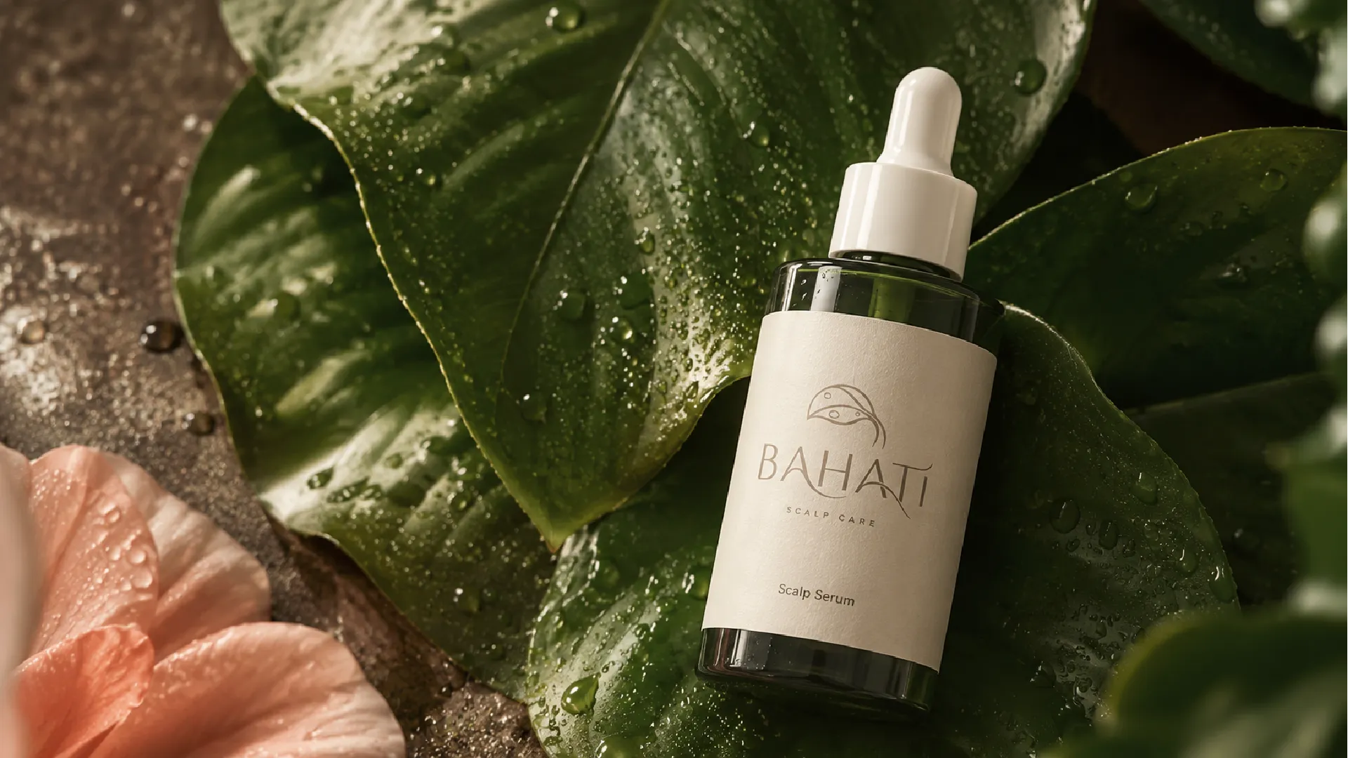
Bahati scalp serum bottle amongst leaves and stone
Campaign still life connects care, nature and tactile ritual.
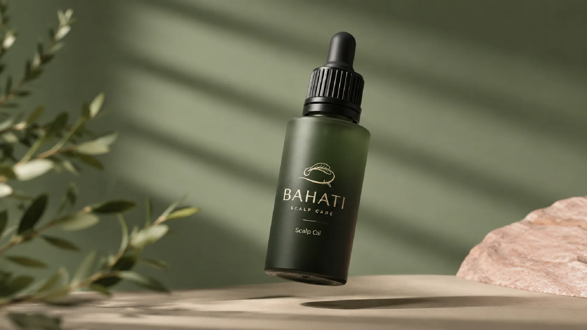
Bahati dropper bottle in soft directional light
Quiet light and generous space make the product feel considered rather than over-styled.
Bahati botanical logo lockup
The selected mark combines a leaf, scalp and growth into one concise symbol.
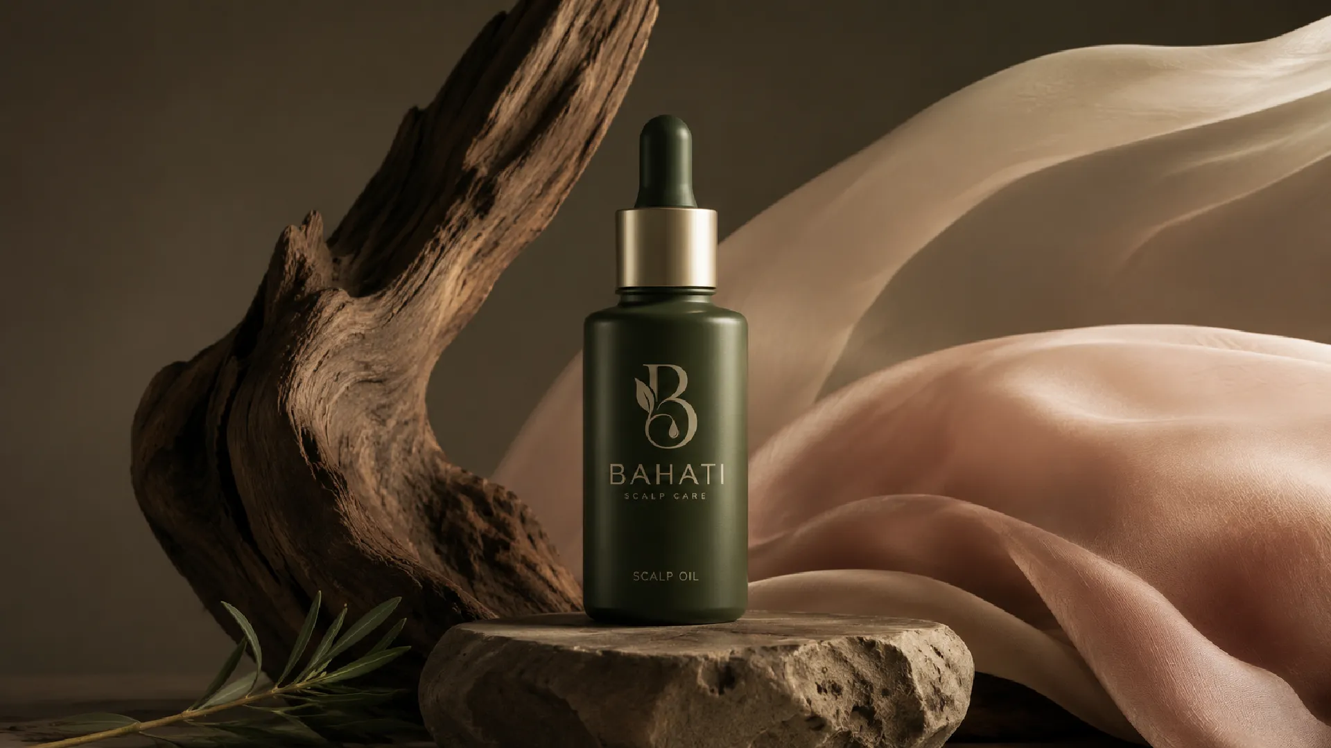
Bahati product bottle with blush fabric and natural wood
The system can shift towards softer campaign moments while retaining recognition.
Bahati early symbol exploration
The discovery stage tested multiple ways to express care, renewal and healthy growth.
Bahati logo construction exploration
Form studies refined the balance between organic character and commercial clarity.
Bahati primary logo on a warm neutral background
A restrained primary lockup closes the identity system.
Outcome

A flexible identity foundation that can support a complete scalp-care range, premium packaging, ecommerce, retail campaigns and educational product storytelling.

BranamaTV Kids Mobile App next project preview
Next project

BranamaTV Kids Mobile App